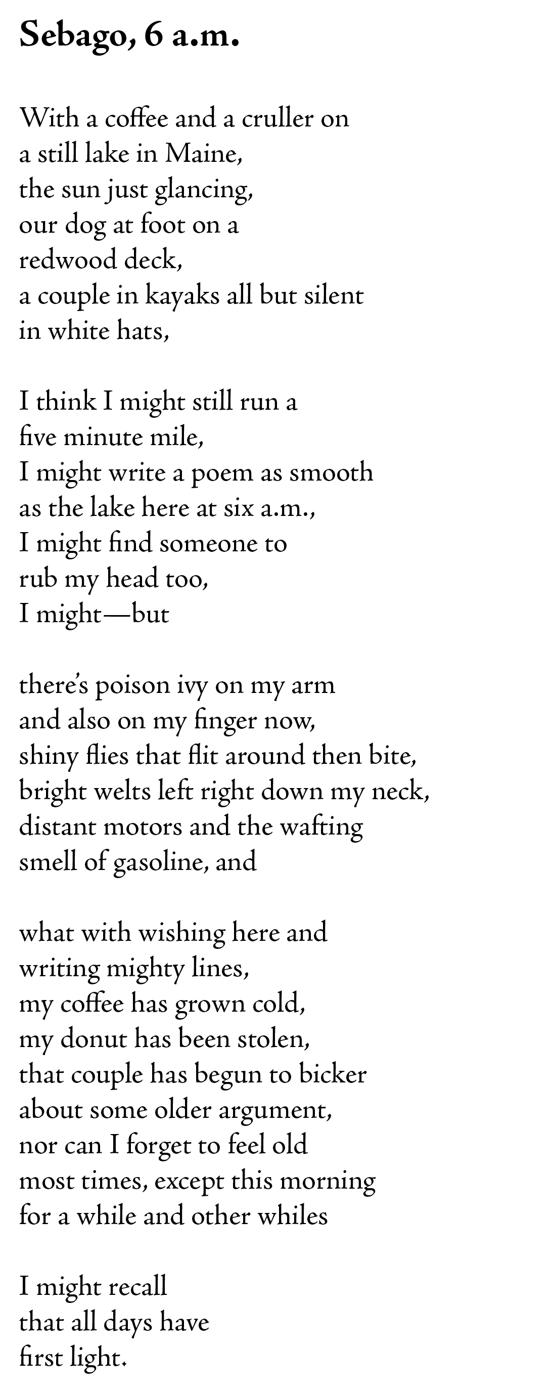
Six a.m. has quickly become 9:30 a.m. this morning, a poem that seems like it might have been written in an hour taking much more than that.
One of the things I love about writing is the time I get to spend tending to individual word choices, choices that may not seem to have much weight in the end, but for me, those moments of indecision and then finding the right phrasing, those are simply joys.
Today one of those moments was finding the word “whiles” at the end of the fourth stanza in the line “for a while and other whiles”.
Originally I used the word “times” which worked, but as I read the poem out loud it just didn’t sound right. It made sense and was an appropriate word, but I’m not here to use simply appropriate words; I want to use words that startle, that surprise, that sparkle.
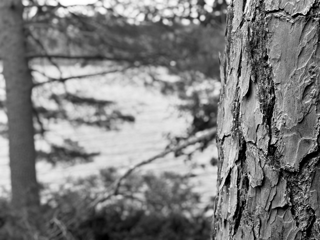
I am not actually on Sebago Lake nor even in Sebago, Maine, though I’m close. I’m on Hancock Pond, much smaller and I’d say more intimate and peaceful.
“Sebago” though has the sound that I wanted and has instant recognition as a location in Maine. But wouldn’t “Hancock Pond, 6 a.m.” work just as well? Yep.
I think part of this decision is my own desire to separate the actual moment I had this morning from the moment I’m writing about in the poem.
They are not the same–things didn’t unfold the way I present them. I didn’t have a cruller (nor even a simple donut). I only have poison ivy on my finger. I don’t have welts on my neck. I did not smell gasoline.
Even more, the thing that changed the most this morning and upset the quiet moment was the wind picking up. At first I could see the trees on the far side of the pond reflected in the water, even before the sun came up.
Now though the wind is blowing a nice bit and there are almost whitecaps on the water. And because of the wind there are absolutely no flies to worry about.
I’m also unsure if I still like the font I have been using for my poems–“Adobe Jenson Pro”. When I saw the periods in bold for the title (a.m.) I had to change them–not the entire font, just the periods (they are now “Source Sans Pro”).
You can see what a period in Adobe Jenson Pro looks like at the end of the poem–it is a bit of a calligraphy plus sign, much too distracting for the title.
I also don’t like the way the word “flies” looks in the poem, the f and the l run together.
And yet, I do like the font a lot. I’m going to keep using it here for my blog. Perhaps not for the book I continue to work on.
I’ve also found, speaking of the book I’m writing, that I miss actually writing poems several times a week. My focus on the book has taken me away from that joy.
One problem is that these cheeky poems will then try to sneak their way into the book themselves! The book’s full, I tell them, but I’m not as tough as I’d like to be, I guess. So perhaps there’s a spot for Sebago still.

Please leave a reply! No need to sign in :)